Table of Contents
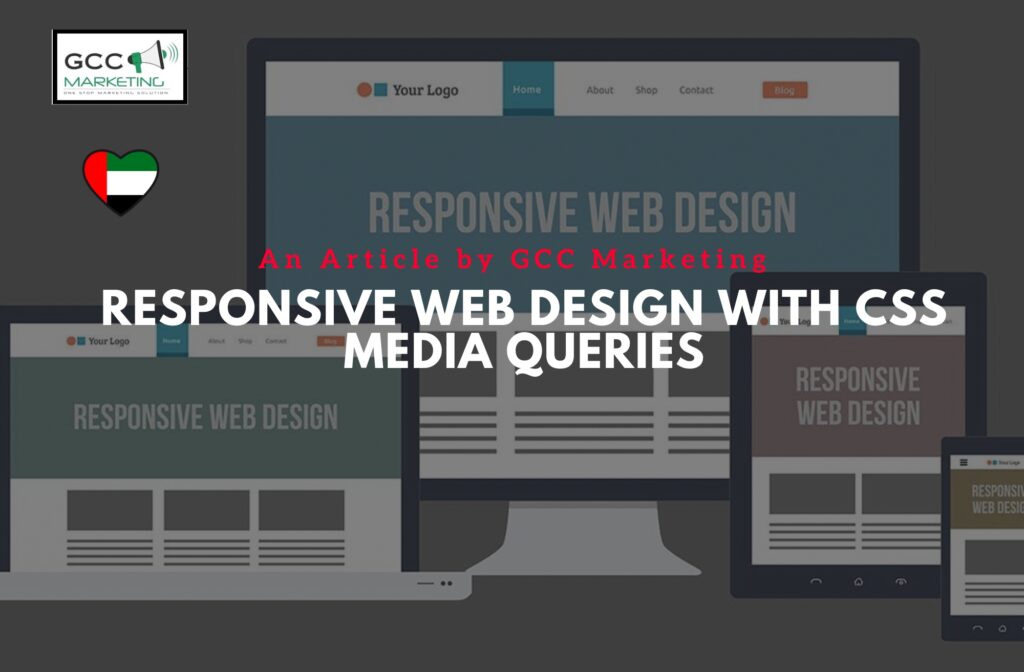
Mastering Responsive Web Design: Harnessing the Power of CSS Media Queries
Responsive web design (RWD) has become an essential component of modern web development. With the ever-increasing diversity of devices and screen sizes, it’s crucial to ensure that your website looks and functions flawlessly on all platforms. CSS Media Queries are your secret weapon in achieving this goal. In this comprehensive guide, we will delve into the world of responsive web design with CSS Media Queries, exploring how they revolutionize the way we create websites.
Creating Stunning Responsive Websites with CSS Media Queries
Understanding the Basics
To embark on this journey of responsive design, it’s essential to grasp the fundamentals. CSS Media Queries are a powerful feature that allows you to apply different styles to your website based on various factors, including screen width, device type, and orientation. This means you can tailor your website’s appearance and functionality to suit the user’s device seamlessly.
The Role of Breakpoints
One of the key concepts in responsive web design is breakpoints. These are specific points at which your website’s layout and design adapt to different screen sizes. By using media queries with breakpoints, you can create a fluid and responsive user experience that works across a range of devices, from smartphones to desktop computers.
The CSS Flexbox Advantage
When it comes to laying out content in a responsive manner, CSS Flexbox is a game-changer. This flexible layout model simplifies the creation of complex designs that adapt gracefully to various screen sizes. We’ll explore how to leverage Flexbox to achieve responsive design excellence.
CSS Magic: How Media Queries Revolutionize Responsive Web Design
Max-Width and Min-Width
Max-width and min-width are two critical properties in CSS Media Queries. Max-width sets the maximum width at which a set of styles applies, while min-width sets the minimum width. By using these properties, you can create responsive layouts that adjust according to the available screen width.
Navigation and User Experience
Responsive web design isn’t just about aesthetics; it’s about creating an exceptional user experience. We’ll delve into how media queries can be employed to optimize navigation menus, ensuring they remain accessible and user-friendly on both small screens and large monitors.
The Variable Font Size Approach
Font size is another crucial aspect of responsive design. With media queries, you can adjust font sizes dynamically based on screen size and readability. We’ll provide insights into creating a variable font size strategy that enhances the legibility of your content across devices.
Crafting a Seamless User Experience: CSS Media Queries for Responsive Websites
The Mobile-First Approach
One widely adopted strategy in responsive design is the “mobile-first” approach. This involves designing the mobile version of your website first and then progressively enhancing it for larger screens. We’ll explore the benefits of this approach and how media queries support it.
CSS Selectors and Media Features
To fine-tune your responsive design, you’ll need to grasp the intricacies of CSS selectors and media features. These tools allow you to target specific elements and apply styles based on various criteria, such as screen resolution and device capabilities.
Unlocking the Potential of CSS Media Queries in Responsive Web Design
Frameworks and Libraries
Building responsive websites can be expedited with the help of frameworks like Bootstrap. We’ll discuss how frameworks integrate with CSS Media Queries to simplify the development process and ensure cross-browser compatibility.
Troubleshooting and Browser Compatibility
Responsive web design can sometimes present challenges when it comes to browser compatibility. We’ll provide tips and tricks for troubleshooting and ensuring that your media queries work seamlessly across different browsers.
Supercharge Your Design with SASS
If you’re looking to take your responsive design skills to the next level, we’ll introduce you to SASS (Syntactically Awesome Stylesheets) and how it can supercharge your CSS, making it more maintainable and efficient.
The Future of Web Design: Exploring Responsive Media Queries with CSS
The Viewport Meta Tag
The viewport meta tag plays a pivotal role in responsive web design. It allows you to control how your website is displayed on mobile devices, ensuring that it scales correctly and remains readable.
Complex Media Queries
For advanced web developers, creating complex media queries can unlock new possibilities. We’ll dive into examples of intricate media queries that adapt your website’s layout and content in response to specific screen sizes and device capabilities.
Making Every Pixel Count: Designing with CSS Media Queries in Mind
SEO and Mobile Users
Responsive design isn’t just about aesthetics and functionality—it also impacts SEO and user engagement. We’ll explore how responsive websites can rank higher in search engines and cater to the needs of mobile users.
Responsive Web Design Best Practices
Throughout this journey, we’ll provide you with best practices, tips, and real-world examples to help you craft exceptional responsive websites that captivate users across different devices.
Responsive Web Design for All: Mastering CSS Media Queries and Selectors
By the end of this comprehensive guide, you’ll have a deep understanding of CSS Media Queries and their role in responsive web design. You’ll be equipped with the knowledge and skills to create websites that look stunning and function seamlessly across various devices, browsers, and screen sizes. Whether you’re a seasoned web developer or just starting your journey, responsive web design with CSS Media Queries is an essential skill that will propel your web projects to the next level. So, let’s dive in and master the art of responsive web design!